Introduction
There is possibly no topic in trading that is as controversial as technical analysis is. During your trading journey, you may come across the absolute fanatics, who swear by it and can prove their success consistently over the years using technical analysis, and the absolute sceptics, who simply do not believe in technical analysis and refuse to do so.
In the below sections, we will take you through a technical
analysis discovery journey. As you will find out, technical analysis is now a
vast field that is not to be taken lightly and trying to actually apply all
methods for a single trade is virtually impossible. What you may opt for
though, as most traders do, is to choose few tools that you are most
comfortable with: study them well, analyse them historically (or back-test
them) and stick to them going forward.
Definition
Technical analysis is one of the two most common methods employed in trading (the other being fundamental analysis). Technical analysis relies on historical data, charts and statistics to analyse price behaviour and establish predictions for the future direction of the stock price. It is a science in the sense that traders rely on statistics for their analysis but it is also an art in the sense that they need to employ their own judgement in establishing patterns and drawing conclusions. The ultimate goal is to make smarter trading decisions and manage market risks effectively.
Before deciding on whether technical analysis is for you or not, it is worth considering the assumptions and philosophy underlying this type of analysis. Technical analysis inherently assumes that history repeats itself because human nature does not change much. This is why technical analysts believe that they are able to establish patterns that can be projected into the future and that can allow “forecasting” future prices.
Unlike fundamental analysis, technical analysis does not try to find cheap or undervalued stocks; it assumes that the market is "always right" and the prevailing price represents a consensus amongst all market participants at every point in time, as determined by supply and demand. It is in this sense that technical analysts argue that technical analysis measures crowd psychology behind price movements. As a technical analyst, you do not spend your time analysing why a move is happening; rather, you accept it as it is, analyse what is happening and act accordingly.

Basics
So, assuming the above appeals to you, you may be wondering how technical analysis delivers on its promises. Indeed, this may be confusing especially for a beginner. Technical analysis offers a wealth of tools, making it impossible to learn (let alone apply) every single one of them. However, there are basic concepts that are familiar to all technical analysts and may serve as a good start.
I - Price Charts
First and foremost, all technical analysts use charts; in
fact, they use charts for almost every factor or quantity they are analysing
but, in this section, we will focus on price charts only. Simply put, price charts
are graphs of historical prices (plotted on the y-axis) against time (plotted
on the x-axis). Not only are they the building blocks of most technical
analysis tools, but they also allow you to:
·
Have a bird’s eye view of the historical performance
of the price.
·
Track prices, draw trendlines (that help you
identify trends) and establish all sorts of patterns. Trendlines connect at
least two top or bottom prices on the chart to indicate a trend. If the line is
downward sloping, then you are (most likely) looking at a downward trend and
you should not buy. On the other hand, if it is upward sloping, then you are
(most likely) looking at an upward trend and you may consider buying.
·
To identify support and resistance lines.
Imagine a floor, off which the price keeps bouncing, and you have got yourself
a support line. Otherwise, imagine a ceiling, above which a price struggles to
break, and you have got yourself a resistance line. These points can be
identified using trendlines. Traders would buy around the support and sell
around the resistance.
· To identify breakouts and reversals. A breakout occurs when the stock price breaks through a support or resistance level (accompanied by a heavy volume). A reversal occurs when a stock price changes direction (accompanied a heavy volume). However, you need to carefully study your chart and identify the trend first. Using different time frames may help too.
There is a variety of price charts. We will describe below some of the most popular types of charts, starting with line charts.
I.1 - Line Charts
Line charts are the simplest to draw and are mainly made up of a line joining each price to the next for a particular time frame, most frequently daily closing prices. This also means that they are not as comprehensive as other charts that include high, open, close and low prices (or some variation of them) so you will not be able to see the range of prices for the corresponding time period.
Some traders believe that closing prices are the most relevant because they represent the final and true consensus between supply and demand while other prices (high, low, etc) create unnecessary noise. Line charts are more suitable than other charts in this case. They may also allow traders to be clearer on major support and resistance levels, trend reversal and breakout and other chart patterns. On the other hand, traders, who would like to see the range of prices and the action taking place during the corresponding time span, need to consider other types of charts that show this information as line charts are not ideal for these purposes. As we will see next, bar charts and candlestick charts make up for this drawback.

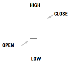
I.2 - Bar Charts
Also known as Open-High-Low-Close (OHLC) charts, bar charts contain more information than line charts because they also show open, high and low prices. The chart is made up of vertical lines or price "bars" where the high and low prices mark the top and bottom edges respectively, the open is represented by a dash on the left and the close is represented by a dash on the right.
The bars can be coloured to indicate if prices have been rising or declining: if the stock price closes at a value that is higher than the opening price (close > open), then the bar will be coloured in green, but, on the other hand, if the close is below the open, the bar will be coloured in red.
Traders use bar charts to find patterns, retrieve information and visualise market action. They can study the trend by observing the colour and direction of the price bars. For example, a majority of green bars in a trend indicates that the trend is upward whilst a majority of red bars indicates a downward trend. Moreover, studying the length of the bar and the position of the high, open, close and low can draw a clearer picture of the tug of war between bulls and bears for the period. For example, if the vertical line (or bar) is long, it indicates a volatile session. If the close is further from the open, it means that the stock has seen much action during the day and bears or bulls have managed to claim a clear victory for the session (depending on whether the close is below or above the open). A close that is nearer to the open signals indecision. If the price closes much lower than the high, it indicates a fizzled rally.

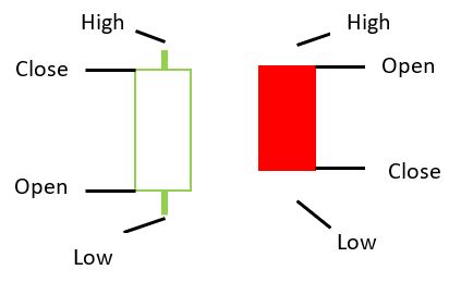
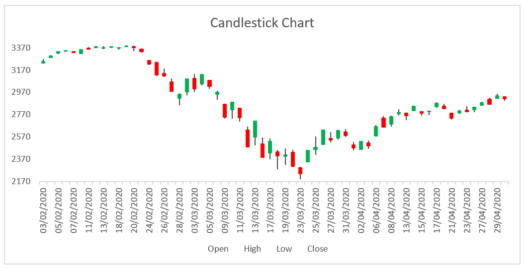
I.3 - Candlestick Charts
We have dedicated one whole page to candlestick charting so you can always refer to that section for more details. In brief, candlestick charts are price charts where the price is displayed in bars that show the high, open, close and low price for the timeframe you are considering.
This type of charts has been invented by the Japanese 150 years ago and used for trading the rice market during those times. The use of these charts now is quite widespread, used for a variety of asset classes. There are many patterns that are repeated again and again on these charts, making candlestick charting a rich type of scientific analysis (or as scientific as can be). Naturally, it has also created a considerable following amongst traders, which means that you may be able to predict how they will react to certain patterns.
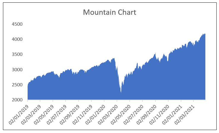
I.4 - Mountain Charts
A mountain chart is similar to a line chart, albeit for area shading underneath the line. The resulting chart has peaks and troughs, making it look like a mountain (and hence the name). Another name for this chart is “area” chart, for obvious reasons. In fact, the use of mountain charts to portray information in finance and business is quite ubiquitous, and it is not exclusive to stock market analysis.
Mountain charts summarise information in an appealing way that vividly conveys the story to the reader. As such, they make it easier for you to visualise and understand a stock price performance over a period of time. You can easily see if the trend is upward or downward. You can also find patterns in the price behaviour through time. However, you still need to be vigilant because there are other details (for example, open, high and low) that may be relevant to your trading strategy but are not accounted for in the mountain chart. Besides, a move can look strong on a mountain chart while, in fact, it is not; studying the size of the volume associated with that move and comparing it to historical values can help a lot. Moreover, you may analyse a mountain chart through different time frames to validate your findings.
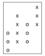
I.5 - Point and Figure Charts
Whilst not as common as other charts, the Point and Figure (P&F) chart still has its followers. In a nutshell, it is a pure indicator of price as it measures price movement (usually using closing prices but it is also possible to use highs or lows) irrespective of time or volume, hence eliminating noise (at least according to believers).
The chart does not plot price against time, like other charts do; instead, it plots price movement as measured by price changes. In this sense, you can imagine it as having only the price axis-one dimensional. It is made up of X’s, indicating upward movements or increasing prices, and O’s, indicating downward movements or decreasing prices. Months or dates can be listed at the bottom of the chart while numbers can be shown on the side.
P&F charts help chartists identify trend reversals and breakouts as well as entry and exit points. They can also be used to identify patterns, which are beyond the scope of this section. Nevertheless, it is worthwhile to look at them, not least for their tremendous help at spotting trend formations. So, before leaving this section, we will look at how to construct a P&F chart.
I.5.1 - How to construct a P&F chart
1. Before you start drawing a P&F chart, you need to remove the two-dimensional image of traditional charts from your mind: there is no longer a time axis and a price axis. It is only price changes that count now - one price axis, that’s it.
2. First, you have to determine the unit of the price, which determines whether an X or an O should be drawn (that is, not all price moves are significant: if a price moves by less than this unit, neither an X nor an O is drawn - the move is ignored).
3. If the price moves up by one (or more) unit(s), as you have defined it to be, you draw an X; on the other hand, if it moves down by one (or more) units, you draw an O. If it has moved by this unit multiple times, you plot multiple X’s or O’s depending on the direction of the move, for example, suppose the price moved down by at least one unit two times, then you plot 2 O’s in one column. You never plot X’s and O’s in the same column.
4. Second, you have to determine how many units make up a (reversal) box, the basic size by which a price has to move in a particular direction for an X to become an O (or vice versa), meaning that there is a trend reversal.
5. To determine whether it is time to move to another column, the number of X’s and O’s in the existing column must reach the number that makes up a box.
II - Market Timing
Market timing is synonymous to technical analysis; the principles are generally applicable to a wide range of assets. Technical analysis gives its followers the gift of market timing: to time their entry and exit trades. What does this mean? It means that market timing allows you to develop an automated trading strategy, using technical analysis tools (such as indicators and oscillators), that allows you to make investment decisions (buy, sell or hold cash) without letting your emotions get in the way. The aim behind market timing is to help you preserve your capital and to allow you to be long during an uptrend and short (or holding cash) during a downtrend.
Easier said than done! How often this is successful can be unravelled by your personal research, study and back-testing; the market is not short of traders who think that market timing does not work. In the below section, we will touch on few approaches that demonstrate how market timing works. It is your job to do the research to decide whether you believe in it or not. However, if you decide to take it up, you need to understand that it is a rigorous discipline requiring a lot of study, analysis, and commitment. Relatively speaking, few people eventually make it as market timers.
II.1 - Support and Resistance
The price does not trend upward or downward, or range sideways clearly and smoothly. Instead, it moves in a jagged way due to forces of supply and demand. However, if you draw trendlines, you will see that the stock price looks as if it is hitting a ceiling the (top trendline) above which it is unable to jump with ease because profit-takers would be selling at that level; this is the resistance level. On the other hand, the price looks like it is bouncing off a floor (the lower trendline), preventing it from falling further, because buyers looking to get into the market would find this price a bargain and would be buying at this level; this is the resistance line. Of course, at some point, the price does cross either line, meaning a breakout has taken place.
As we have seen before, Dow theory stipulates that market trend is made up of three phases: accumulation, public participation (congestion) and distribution. During the accumulation phase, “smart” money (or people with knowledge) would be buying quietly at low prices. In the congestion phase, other traders (especially trend-following technical analysts) start taking notice and piling up into the stock. Finally, after the price has been hiked up, smart money starts distributing its holding, selling the stock at a high price.
How does this relate to the concepts of support and resistance? The accumulation phase actually starts during/after a sharp and major sell-off. Generally, buyers would still be scared at this level, anticipating further sell-off. However, the market would have already bottomed, and smart money starts entering the market. They find it easy to buy (at a bargain) because there will be plenty of investors looking to dump their holdings (due to fear). This means that the price will always find support.
Once other traders notice this support, they pile up quickly taking the price into new highs. This rally is again sharp and quick (the retail investor is usually left out). At these new highs, retail investors experience FOMO (Fear Of Missing Out) and start getting in (out of greed); the general outlook in the market becomes rosy. This is where smart money starts selling slowly and quietly, and the distribution phase starts. This creates a resistance level, preventing prices from going higher. When smart money sells all its holding, the price breaks through support and another sell-off takes over.
Of course, it is not as simple to track this in the market. Sometimes, accumulation and distribution phases can take months and even years; sometimes, they are extremely sharp and short. Moreover, it takes skill and hard work to be able to identify support and resistance lines. You need to be monitoring price action and volume very closely. As we have seen on the Volume page, (high) volume can often be used to confirm breakouts and reversals.
Support and resistance lines change after a breakout, getting replaced by new support and resistance lines. Also, of significance is how often these levels are tested. Experience has proved traders tend to place stop and limit orders at “rounded” numbers (ending with 0s or 5s). These new levels then serve as support and resistance for the next phase. Sometimes, an old support level becomes a new resistance level (and vice versa) after a breakout.
II.2 - Indicators
Indicators form the backbone of technical analysis. Charts and trendlines on their own do not leave you with much to work with when developing your trading strategy; you need to add indicators. There are several types of indicators. Two of the most popular types are trend-following indicators that help you identify trends, and oscillators (momentum indicators) that measure momentum in the market and help you identify turning points. Other types include volatility indicators and volume indictors. In this section, we will only be looking briefly at trend-following indicators and oscillators, with some examples.
II.2.1 - Trend-Following Indicators
II.2.1.1 - Moving Averages
We have dedicated a full tutorial to the concept of Moving Averages, so we will only be touching briefly on this concept here. A Moving Average is a trend-following indicator. This means that it can be used to determine the current price trend. If the moving average line is slanting upwards (i.e., it has an upward slope), it indicates an upward price trend. On the other hand, if it is slanting downwards (i.e., it has a downward slope), it indicates a downward price trend. Finally, a relatively flat line indicates a ranging or sideways market.
However, bear in mind that it is a lagging indicator due to the way it is constructed so you will generally be missing the first part of the move especially for moving averages with a longer time period. Moving averages are constructed by smoothing recent prices depending on your time frame. So, you can calculate a moving average for any period that works well with your trading strategy (e.g., 10-day, 50-day, 200-day). In general, the 200-day Moving Average movement is the most indicative of the price trend. There are two ways to calculate the moving average: the Simple Moving Average SMA and the Exponential Moving Average EMA. We will not go into the details of calculating them here but you can refer to the tutorial if you wish to find out more.
There are two ways to time the market using moving averages: when the short-term moving average crosses the long-term moving average (for example, 50-day vs 200-day), and when the price crosses the moving average. In the former case, you want to be on the long side of the market when the short-term moving average crosses above the long-term moving average, and you want to be on the short side of the market when the short-term moving average crosses below the long-term moving average.
In the latter case, you want to be long when the price crosses above the moving average (the length of which depends on your time period) and short when the price crosses below the moving average. However, you want to avoid getting whipsawed, which happens when the price frequently crosses above and below the moving average indicating several buy and sell signals within a short period of time. Whilst they are not unusual in any trend, they are more common during ranging markets where the trend is not clear. The choice of the moving average duration also plays a role here, for example, moving averages with very short durations can lead to more whipsaws than those with long term durations.
11.2.1.2 - MOVING AVERAGE CONVERGENCE DIVERGENCE (MACD)
This is a trend-following indicator that relies on the concept of moving averages (in particular, the exponential moving average EMA), which means it assigns more weight to more recent prices. It does however take this type of analysis one step further.
MACD is based on two lines: the fast MACD line, which is made up of two EMAs, and the slow Signal line (its 9-period EMA). The former line responds to changes in prices faster than the latter line. The MACD histogram is the difference between these two lines. The histogram is plotted as a series of vertical lines and it serves as an oscillator. It helps you monitor the relationship between the fast line and the slow line: if the two lines approach each other, this means that they are converging and if they are moving further from each other, then they are diverging (hence, the name).
Therefore, the histogram measures the actual convergence and divergence between the fast and slow lines. If it is positive, it is plotted above the zero or equilibrium line. On the other hand, if it is negative, it is plotted below the zero line.
II.2.1.2.1 - How is the MACD constructed?
1. Calculate 12-period EMA.
2. Calculate 26-period EMA.
3. Calculate the fast line: Fast MACD Line = 12-period EMA – 26-period EMA
4. Calculate the slow line: Signal Line = 9-period average of the fast MACD line.
5. Calculate the histogram: MACD histogram = fast MACD line – slow Signal line.
Timing the market using MACD involves monitoring the relationship between the two lines. If the lines start diverging, this indicates that the market trend is growing stronger and the histogram moves away from the zero line. If, on the other hand, they converge to the point of crossing, then this indicates that the trend is growing weaker and the histogram will be at the zero point. If both lines fall, then the histogram will move below the zero line.
To start with, always keep an eye on the the top and bottom of the range to tell if the move is overdone or not. Generally, if the fast MACD line is above the slow Signal line (so the MACD-histogram is positive), this indicates a buy signal. On the other hand, if the fast line goes below the slow line (so the MACD histogram is negative), it indicates a sell signal. In addition to this, monitor overbought and oversold conditions. When the lines are in the oversold territory (and the fast is above the slow line), they send a buy signal. However, if they are both in oversold territory, they send a sell signal especially if the fast line crosses below the slow line.
Some traders look for a divergence between price action and the indicator. If the market makes a new high but the oscillator fails to do so (the histogram fails to make another top), it sends a bearish signal. In fact, some traders believe that divergence between the MACD-histogram and prices sends one of the strongest signals in the market as it does not happen quite often but when it does, it can indicate turning points. Other traders also use Technical Analysis patterns in the histogram to formulate entry and exit points. In all cases, this indicator has to be used in conjunction with other tools to validate signals.
II.2.2 - Oscillators
11.2.2.1 - Relative Strength Index (RSI)
RSI is a common momentum indicator or oscillator that measures price relative to itself over a time period (usually 14 days) by calculating the ratio of the periods the price has closed up to the periods where the price has closed down. Its value always ranges between 0 and 100.
11.2.2.1.1 - How is the RSI constructed?
RSI = 100 – 100/(1+RS)
RS = average of x periods up closes / average of x periods down closes;
First Average Gain = Sum of gains over the last n periods / n
First Average Loss = Sum of losses over the last n periods / n
Subsequent periods:
Average Gain = (prior Average Gain * (n-1) + current Gain) / n
Average Loss = (prior Average Loss * (n-1) + current Loss) / n
The lookback period is usually chosen to be 14 days. However, you can choose the period that best suits your trading strategy. Keep in mind though that a short period leads to a more volatile indicator, generating frequent signals that are not necessarily reliable, while a longer one is less volatile, generating less signals albeit more reliable ones.
RSI indicates when a market is overbought (at an RSI value of 70 or above) or oversold (at an RSI value of 30 or below). As the line approaches overbought or oversold territories (top or bottom), there is a good chance that the market will turn around. However, beware that it can stay in overbought or oversold territory for a while as the market makes higher highs and lower lows. Again, use this indicator in conjunction with other tools.
Timing the market using RSI means taking action around these oversold and overbought regions. In general, buy signals are generated when the RSI hits the oversold line (30), usually rising from below and sell signals are generated when it hits the overbought line (70), generally crossing from above. There are variations of these market entry strategies depending on the trading style. Some traders prefer to buy while the stock is in oversold territory and to sell while the stock is in overbought territory. Other traders perceive the 50 line in the middle as a support line during a strong market uptrend and so the RSI may not dip below it. In this case, a buy signal is generated as soon as the RSI crosses 50 because momentum would be up, and a sell signal is generated if the RSI breaks below 50.
As with other indicators, some traders look for divergences between price action and this oscillator as the latter can send early signals. A bullish divergence (buy signal) takes place if the price makes a lower low but RSI makes a higher bottom than that during the previous decline. On the other hand, a bearish divergence (sell signal) occurs when the price makes a higher high but RSI makes a lower top.
Another way to use RSI to time the market is by looking for Technical Analysis patterns in RSI. They draw trendlines, and support and resistance lines on RSI charts. They buy as long as the trendline holds and sell when it gets broken. RSI usually retraces back to its trendline if It moves too far off it. They also look for patterns such as double tops and triple tops. The price is expected to fall hard if RSI cannot break through those levels.
11.2.2.2 - Stochastic Oscillator
This is a momentum indicator or an oscillator that is considered good at picking market tops and bottoms. It is made up of two oscillators: a slow line, known as %D, and a fast one, known as %K. The fast line, %K, measures the relationship of the current close to the last n-period (e.g., 5) after which it is smoothed. The %D line is a 3-period average (e.g., 3-day MA) of the smoothed %K line. This makes the %D line more important because it is smoother and more stable than the %K line.
11.2.2.2.1 - How is the stochastic oscillator constructed?
1. %K = 100 * (C - L_n) / R_n
2. Slowed version of %K = average of %K (as per above formulae) over the last 3 periods
3. %D = 3-day MA of %K (slowed one). It can be computed as:
• %D = 100 * 3-day sum (C – L_5) / 3-day sum (H_n – L_n)
• Slow %D = 3-day MA of %D
where, C = last close
L_n = low of last 5 periods (lowest Low Price)
R_n = range of last 5 periods (highest High H_n – lowest Low L_n)
n = number of days
The stochastic oscillator indicates overbought and oversold conditions in the market. It is considered in oversold territory if it is between 20 and 30, and in oversold territory if it is between 70 and 80. The exact levels are determined by the trader, for example, some traders prefer to mark oversold territory by 20 and overbought territory by 80.
One of the most common ways of using the stochastic indicator to time the market is by placing buy or sell points around oversold and overbought territories. The most straightforward strategy, especially in a choppy market, is to buy when the indicator hits oversold levels and sell when the indicator hits overbought levels.
However, there are more sophisticated ways of reading this oscillator and using the corresponding signals to place trades. It is best to use both lines in tandem. A strong buy signal is indicated when both lines are moving in a clear direction: rising above the oversold area and towards the overbought level. The lower the level of the indicator at which you buy, the more the potential for profits. However, do not rush: if the lines are below the oversold level and start rising, wait until they cross the oversold line before you get in.
The position of the fast line (%K) vis-à-vis the slow line (%D) also plays a role in determining entry and exit points. If the fast line crosses over the slow line, then this generates a buy signal. To make sure this is not a false signal, you need to check that the crossover is taking place above the oversold line and it happens after the slow line has bottomed (keep in mind that the fast line usually turns before the slow line so the when the slow line turns, it gives a stronger signal). However, during a strong trend, the lines may not reach the oversold line.
Stochastics can be tricky to work with because for stochastics to be in the overbought area may mean that the market will turn, but this can also mean that the trend is strong and can continue for a while. Some experienced traders buy when the lines are above the overbought area, but not yet turning lower, and place a stop when the lines move below the overbought territory.
Once again, divergence between this oscillator and prices gives entry and exit signals. The stochastic oscillator measures a market’s last close relative to prices over a specific period. In an upward trending market, the close tends to be near the highs and vice-versa for a downward trending market. Therefore, a high stochastic indicator signals strong momentum. As the trend peaks, the indicator hits the highest level. As the uptrend starts to slow down, prices will start closing away from the high causing the indicator to turn. Even if the market is still trending upwards and it is making higher highs, the indicator will turn if the close is farther away from the high. This divergence is a sign of a move in the direction of change.
III - Risk Management
Risk management is extremely important. It is one of the most crucial concepts in trading, albeit one of the most overlooked. You can do your homework, devise a proven trading strategy and have the discipline to stick to this plan, but you can still incur losses due to various reasons, largely beyond your control. This is where risk management is most needed: if you do not have an automatic system that kicks in when you start incurring losses, you can wipe out your capital waiting for the market to turn. How many times have you bought or short a stock, only for the market to turn in the opposite direction shortly after that? There are some very good institutions with solid reputation whose stock values have been wiped in a very short span of time (think Enron and Lehman Brothers).
All traders, irrespective of the level of their experience, make mistakes and you will not be any different. It is just that you do not want your mistake to cost you all your capital or a significant portion of it. In fact, most successful traders assert that they incur small losses much more frequently than they make big wins.
Another important decision that you need to automate is when to take profits. Have you watched a stock price that you own go up 30% above and beyond your purchase price only for it to reverse and fall below the purchase price? It is fulfilling to watch your stock doing well; however, you need to be decisive about when to sell: do you put a limit such as 20% appreciation at which you sell or do you use a technical analysis tool that specifies your exit point? Whatever it is, decide and stick to it!
A good risk management plan thus ensures that you automatically manage your losses properly and hence, at the very least, preserve your trading capital as well as make a decent return on your appreciating stocks. It needs to be automatic because when emotions are on the line, you are least likely to stick to your plan but this is when you will need it most. Risk management is more difficult, and arguably more important, than trading.
III.1 - Loss Management
Loss management is not about avoiding losses because losses are inevitable in trading. Loss management is about having a solid plan that ensures you handle your losses as they occur, hence avoiding large losses that wipe out your portfolio or, at least, a good chunk of your profits. This requires you first and foremost to cut losses before they balloon. You can spend a year accumulating profits but, if you do not cut your losses at a reasonable level, you can watch these profits (and a year’s worth of hard-work) evaporate right before your eyes!
Not only do you have to devise a plan before you start trading, but also you need to adhere to it. Why is that? That is because when emotions are running high, chances are you will not be thinking straight, trying to draw on every glimpse of hope you can think of to convince yourself that you are right and that the stock will soon do better; also, we do not like to see negative income especially when it is “inflicted” on us by us. Well, do not! This is not the time to prove yourself right! It is quite likely that a stock price will go well below your purchase price and stay there for years. You cannot do anything to change this, but you can cut your losses early and move on. In fact, if you do cut your losses at the right time, then you only need to be “right” less than half the time. These are the winning trades that will make up for the small losses.
The general guidelines are to know when to take losses and to set your stop loss points accordingly. These may be easy for you to set but certainly very hard to stick to. Your emotions are going to get in the way: you do not want to admit you have been wrong in your decision to buy the stock that is losing money, or you are hoping that the price will go up again. The below tips will hopefully help you with getting over these emotions if they hit you at the wrong time!
- Losses can, and do, balloon until you are completely wiped out. Besides, a loss of 50% means that the stock price will need to double before you break even. For example, suppose you have bought XYZ at $100 just before it turns down and starts a freefall. It goes beyond your stop loss limit of 10% but you are 100% positive that tomorrow it will be back up. Why shouldn’t it? You have done your homework and you are convinced that this is a good stock. Unfortunately, the market does not care about what you think, and the stock goes down all the way to $50. For you to break even, it has to more than double (including fees). Now what are the chances of this happening?
- A small loss is like a small tuition towards learning something valuable that you can apply later on, and actually profit from.
- Setting a stop loss point and sticking to it offers you peace of mind because it acts like an insurance on your portfolio. You never regret insuring your car for example even if you do not make any accidents for the year, so why should you regret making a small loss even if the stock price makes a turn up straight after you sell it (which is highly likely!)?
- Avoid averaging down or adding to a long position while the stock price is on its way down. There is always a reason why the price is going down. As soon as it moves below your purchase price, you should accept that you have been wrong. Do not make this worse by adding more.
- A general piece of advice is to buy at the “right time,” as signalled by your back-tested models, in order to avoid being forced out of your position too soon. Resist the urge to buy impulsively especially when the euphoria is high!
III.1.1 - Stop-Loss Points
Before you buy a stock, you need to set your stop losses and to stick to them blindly. By the end of day, this is what determines that you will stay in the game by ensuring your losses do not wipe your portfolio out. There are different ways by which you can set your stops. Choose the method that works for you and follow it religiously. A word of caution is worth mentioning here: avoid setting your stops at round numbers – this region is quite crowded. Sometimes, the price does not reach this level and, at other times, it is easy to stop you out of a good position using that.
III.1.1.1 - Absolute Stops
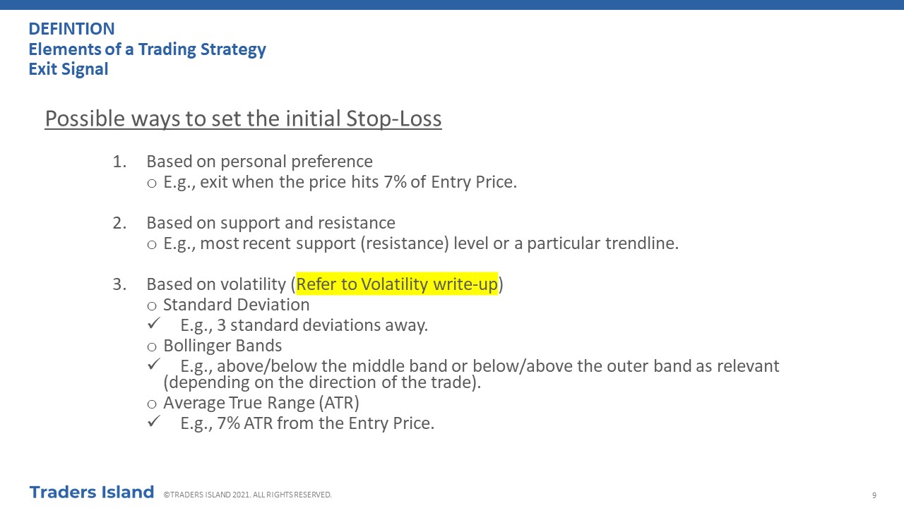
- You would set an absolute number on how much you are willing to lose on a single position, e.g., a maximum of 5% means that you will liquidate once your losses on a particular trade or position reach 5% of that trade capital. Generally, you are advised against holding onto more than 7%-8% losses.
- You can also allow yourself a bit of leeway if the stock makes an unexpected strong move at the back of non-fundamental bad news or irrational selling; so, for example, you may set a stop at 7% instead of 5%.
- You can use a volatility measure, and a multiplier, to set your stop losses. It is common to use the historical standard deviation as a volatility measure. Your stop loss point will be this volatility measure multiplied by the multiplier (3 is quite common). You liquidate your position once the stock price hits this point.
- You may also decide to set different stop loss points for different markets. For example, in a bull market, you can afford to have stop loss points at the upper end of the range you are willing to consider for stop losses. On the other hand, in a bear market, your gains on long positions are indirectly capped and so you cannot afford taking a lot of risk so you may like to set tighter stop loss points (e.g., 3-4%).
- Your trading or investment horizon plays a role in setting stops as well. For example, if you are a short-term trader, you cannot afford to wait for the stock price to correct itself like a long-term investor does. In this case, you have to set a more conservative stop-loss point, e.g., 3% instead of 5% or 7%.
III.1.1.2 - Average True Range (ATR)
III.1.1.2.1 - Definition
- It is an indicator that measures volatility.
- It is not an indicator of price direction.
- It is particularly useful if there is very high volatility or frequent gap and limit moves.
- In this case, it may be a better measure than the high-low measure.
- It quantifies the degree of interest or disinterest in a move.
- It is the average of the true range over a period of time (a set of 9-14 observations is good).
- It can be calculated on intraday, daily, weekly or monthly basis.
III.1.1.2.2 - How is ATR calculated?
III.1.1.2.2.1 - Formulae and Computation
- The first TR is equal to (Current High – Current Low)
- True Range (TR) = Max of
- Current High – Current Low
- ABS(Current High - Previous Close)
- ABS(Current Low – Previous Close)
- The first ATR is the arithmetic average of TR for the period
- Current ATR = (Prior ATR * 13 + Current TR) / 14
- Projected High/Low
- Projected High = Current Low + Current ATR
- Projected Low = Current High – Current ATR
III.1.1.2.3 - How is ATR used to calculate set stop-loss points?
- The most straightforward way to set stop loss points using ATR is to multiply the current ATR by 2, and then you subtract this number from the purchase price.
- Keep in mind that a wider ATR signals increasing volatility and vice-versa so consider whether you are setting your stop on an exceptionally volatile or calm day.
- The type of market also has its implications: bear markets are expected to show wider ATR than bull markets do, due to the fear in the market. This means that you may run the risk of setting a low stop-loss point in a bear market, and vice-a-versa in a bull market. In a bear market you would anyway be going against the trend, so you do not want to make this worse by setting low exit points.
- In these scenarios, it is perhaps better to use the %ATR method to set your stop losses, whereby a stop loss point is set at x% of the prevailing ATR, subtracted from the purchase price.
III.1.1.3 - Other Approaches
- A simpler approach to the ATR one is to set the stop-loss at a tick below the lowest low of a relevant timeframe, e.g., the lowest low of the purchase day or the week, etc…
- Specialised traders may alternatively prefer to use charts or technical analysis tools to set precise stops as soon as they enter the market. We have touched on few of these approaches in the various sections explaining technical analysis and in specific tutorials.
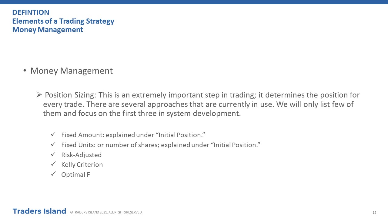
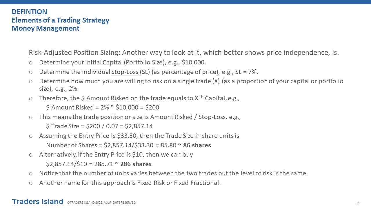
III.2 - Position Sizing
Position sizing helps you determine the maximum number of shares or contracts you are allowed to trade, given your risk tolerance. In simple terms, it answers the following question:” How many shares of stock XYZ should I buy?” When done properly, position sizing is like protecting your portfolio against large losses by trading the “right” size or position for each trade and exiting at the “right” time. As such, you ensure that you keep your losses small, avoiding one large loss to wipe out your entire portfolio. It does hinge on you making some prior decisions such as determining your risk tolerance and setting your stop losses.
III.2.1 - Position Sizing Step-By-Step
- Total Capital: decide on your total trading capital, e.g., $100K.
- Total Number of Positions: decide on the total number of positions you would like to hold, e.g., 4 positions (i.e. 4 stocks).
- Select your stocks and record their prices.
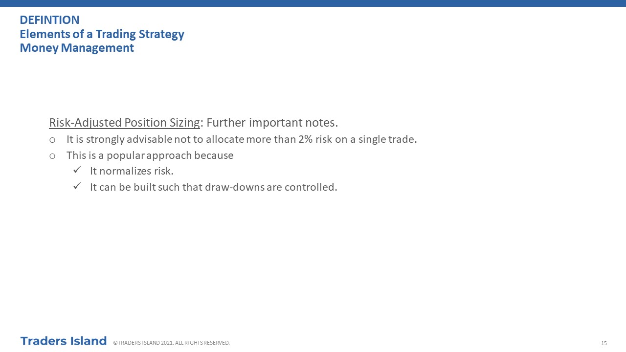
- Maximum Loss per Trade: decide on how much of your total capital you are willing to lose per trade or position (usually advised to be between 0.5% and 2%), e.g., 2%.
- $ Risk per Trade: based on 3 and 6, calculate the maximum risk per trade that you are willing to tolerate:
$ Risk per Trade = Total Capital * Maximum Loss Per Trade.
e.g., $100K * 2% = $2000. This is the maximum you are willing to lose on this trade or position.
- Stop-Loss Exit Point: this is the share price at which you will exit the trade to avoid mounting losses; first, set up a stop loss point according to your risk appetite, e.g., 7% of the purchase price, or using technical analysis tools or charts. If the price reaches that point, it will automatically lead to a sell order of the entire position; for example, assuming a stop loss of 7%, then $100 - $100 * 7% = $93 is the price that triggers a sell order because it means your stop loss limit order has been hit.
- Stop-Loss Point Risk: calculate how much will be risked per share given the above:
Stop-Loss Point Risk = Purchase Price – Stop-Loss Exit Point
e.g., $100 – $93 = $7.
- Maximum Position Size (in Shares): based on 7 and 9, calculate the maximum number of shares (position size) that you can hold:
Maximum Position Size (Shares) = $ Risk per Trade / Stop-Loss Point Risk
e.g., $2000 / $7 = 285 shares (approx.) and capital per position = $28,500. The maximum you would lose if your stop loss limit gets hit is: 285 * $7 = $2,000 (approx.). This is the maximum number of shares that you can own, given how much you are willing to risk. You do not have to trade that much but you cannot trade more contracts than specified this number. In fact, it is advisable to trade in fractions of this number and gradually pyramid your position.
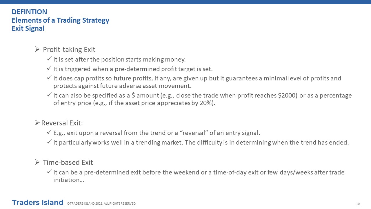
III.3 - Profit Taking
Equally important to cutting losses and position sizing is profit taking. Before you enter a trade, you need to have an idea at which point you would like to sell. You do this by having profit rules in place and sticking to them. If you do not have such rules in place, you will be running the risk of chasing tops only to watch your stock turning around and your profits dwindling into a loss. Bear in mind that you will rarely sell at the top, just like you will rarely buy at the bottom. You are trading to make a profit… this is the end game. Keep fixating on this and be consistent instead of taking unnecessary risks by trying to chase few more pennies. It is very frustrating to be a good stock picker but to end up losing money on your good stocks after stellar paper profits. A good profit plan ensures this does not happen. There are several methods which you can use to set your profit-taking points.
III.3.1 - Absolute Profit-Taking Points
- You would set an absolute number at which you sell your stock, e.g., 20%. Obviously, this depends on where you have bought, which is another reason why you should do your homework and buy at the “right” time. If you have bought too high, you run the risk of barely making 5%, even if you have picked a good stock. You have to be vigilant in this case to avoid having the price turn down after a 5% appreciation and hit the stop-loss point without ever reaching you 20% profit-taking point.
- If you make 20% on just three of your stocks (and provided that you are cutting your losses on other stocks in time), you will be in a pretty good shape by the end of the year. For example, suppose you start the year with $20,000 and you put it all into one stock. If you make $4,000 (20% of $20,000) on that trade, your portfolio value is now at $24,000. Suppose again you make 20% on your next trade, your portfolio value will become $28,800 ($4,800 + $24,000). On your third trade, assuming that you make 20% in profits, your portfolio value will now be at $34,560 ($5,760 + $28,800). This is actually a 72.8% increase from your original capital. Of course, the above analysis holds assuming you make 20% on each trade and you cut your losses short.
- You can allow yourself a bit of leeway if the stock vaults up after you have bought it. In this case, you may want to wait few weeks before you sell, provided you monitor it on daily basis and keep open eyes for any sell signals. If you are unable to do so, you are better off with pocketing what you have and forfeiting any potential, but risky, profits.
- You may also decide to set different profit-taking points for different markets. For example, in a bull market, you would set your profit-taking points at %5, or more, above the points that you set in a bear market.
III.3.2 - Profit to Loss Ratio
- Another approach is to link targeted profits to potential losses by using a profit-loss ratio. Your profit target should obviously exceed your maximum expected loss. For example, if you aim for a 20% profit, you should aim to cut your losses at 7%. This also implies that your risk-reward ratio per trade makes the trade worthwhile.
- You may use your exiting stop-loss points to set profit to loss ratios. To make this idea clearer, let us look at an example. Assume that you buy a stock at $100, and you place a stop-loss point at %7, which is equal to $7; this is the risk you are assuming on this trade. Now, to make it worthwhile, you want your profits to exceed this value. If you are using a 3:1 profit to loss ratio, this means that your profit-taking point should be set at 20% or $20 (nearly 3 times the risk you are assuming, 3:1).
- To decide on a profit to loss ratio, back-test your trading strategy, in particular, your entry points over several data sets, and decide which ratio works best, e.g. 2:1, 3:1, etc… You can always adjust profit to loss ratios as you build up experience.
III.3.3 - Trailing Stops
- A trailing stop is used when the trade is working in your favour.
- Stops are moved higher for long positions and lower for short positions if prices move favourably.
- As the name implies, such stops “trail” the stock price as it moves higher. They can also be set in such a way that you do not lose money if the trade does not move favourably.
- If set properly, they ensure that you do not get stopped from accumulating a larger potential profit immaturely, whilst avoiding large losses.
III.3.3.1 - So how do trailing stops work?
- Set a trailing stop at a specific distance from your purchase price.
- If the price makes an adverse move hitting the level corresponding to the trailing stop, a sell order is triggered, and your losses are cut short.
- If the price goes up, the trailing stop will also go up.
- However, the trailing stop will never go down. A sell order is triggered once the price level corresponding to this trailing stop is hit.
Example
Suppose you buy a stock at $100 and you set a trailing stop at 10%. This means that if the price moves to $900, a sell order will be triggered. If the price moves up to $125, so will the trailing stop and the corresponding price level that will trigger a sell order is at $112.5 ($125 - $12.5). If the price falls from $125 and hits $112.5, your stocks will be sold. However, it has to reach this level for the sell order to happen. Otherwise, if it corrects down from $125 briefly but then moves back up again beyond $125, the trailing stop will move as well.
III.3.3.2 - How do I set a trailing stop?
- Setting a trailing stop is difficult. You do not want to set a stop that gets triggered easily, nor do you want to set a stop that is too far it will never get hit.
- Setting a trailing stop depends on the type of market too. In a bull market, your trailing stop would be wider than that in a bear market.
- The current volatility in the market plays a major role as well. Trailing stops in volatile markets are usually wider than those in less volatile markets.
- There are three possible approaches to setting a trailing stop:
- One way to set trailing stops is by incorporating recent pullbacks or retracements depending on your time frame. In other words, you want to allow for normal stock moves in the form of pullbacks. For example, if a stock would normally make a 5% pullback within the time-frame you are looking at, a trailing stop of 10% would make sense; if such a stock makes a retracement that is greater than 10%, then this can be indicative of further underlying issues.
- Parabolic Time/Price System: this is one of the less well-known indicators created by Wilder in 1976. Its aim is to help traders ride trends and catch reversals. However, it is a particularly good tool to use when setting trailing stops. In this case, stops are set according to the following formula:
Current Stop = Previous Stop + AF * (EP - Previous Stop)
- Current Stop: current stop such as the stop set for today's trade.
- Previous Stop: previous stop such as the stop set for yesterday's trade. You set the initial stop using a method of your choice, such as the absolute stop on the purchase price.
- AF: Acceleration Factor; it determines how fast a stop is moved in the direction of the trend. It starts at 0.02; then, it increases by 0.02 every time the trade makes a new high in an uptrend or a new low in a downtrend. These values are not set in stone: you can change them if your research leads to more suitable numbers.
- EP: Extreme Point; it is the extreme point of the trade such as the highest high in an uptrend or the lowest low in a downtrend.
- Moving Average Trailing Stop: Choose a moving average that fits well within your time frame, for example, if you are a short-term trader, choose a 20-day Moving Average. Set your trailing stop to match this moving average such that it gets triggered when prices cross below for a long position, or above for a short position. In other words, exit your position when prices cross this moving average.
- High/Low Trailing Stop: The trailing stop is set to the lowest low over a certain period, e.g. days or candlestick bars, for a long position and the highest high for a short position. The trailing stop gets triggered when the stock price hits one of these levels depending on your position, leading you to close your trade.
III.3.4 - Other Approaches
Chartists and technical traders use technical points on charts to take profits. These are specific to each method and some of them have been covered in tutorials and various sections explaining technical analysis on this website.
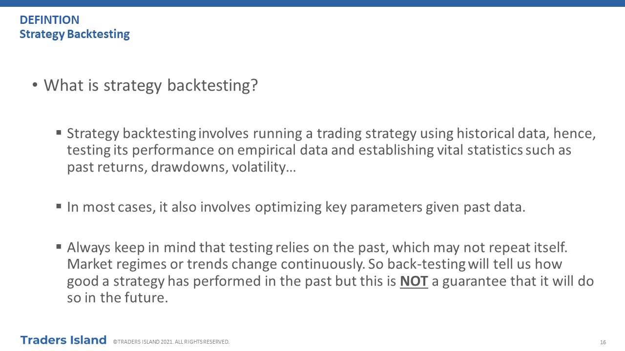
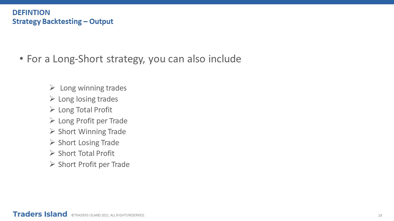
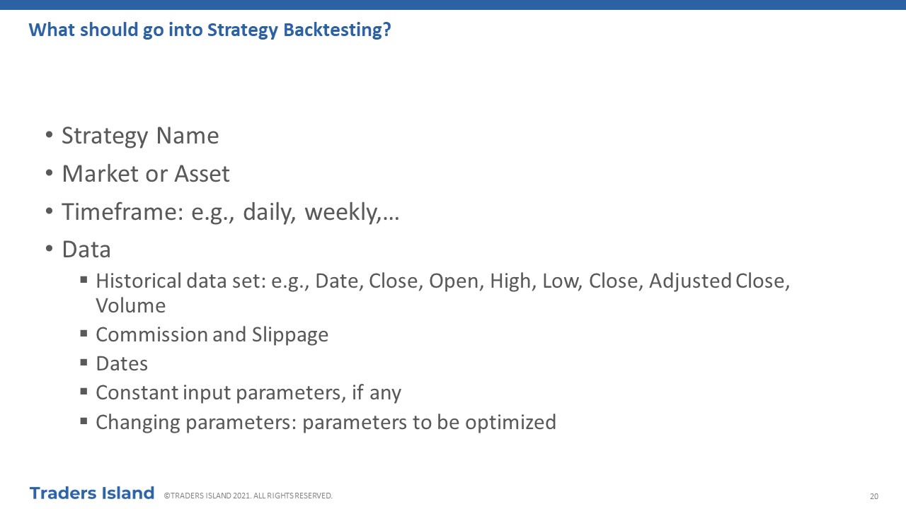
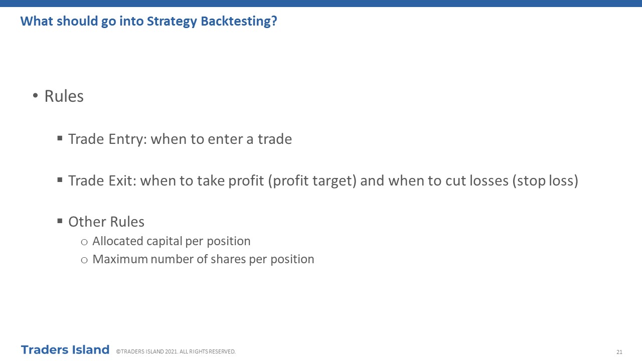
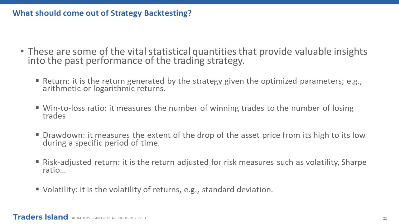
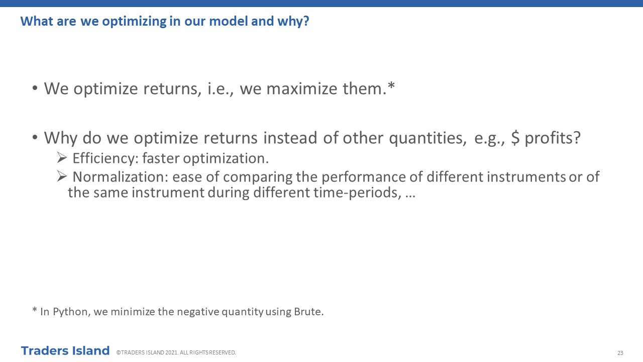
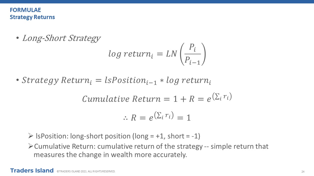
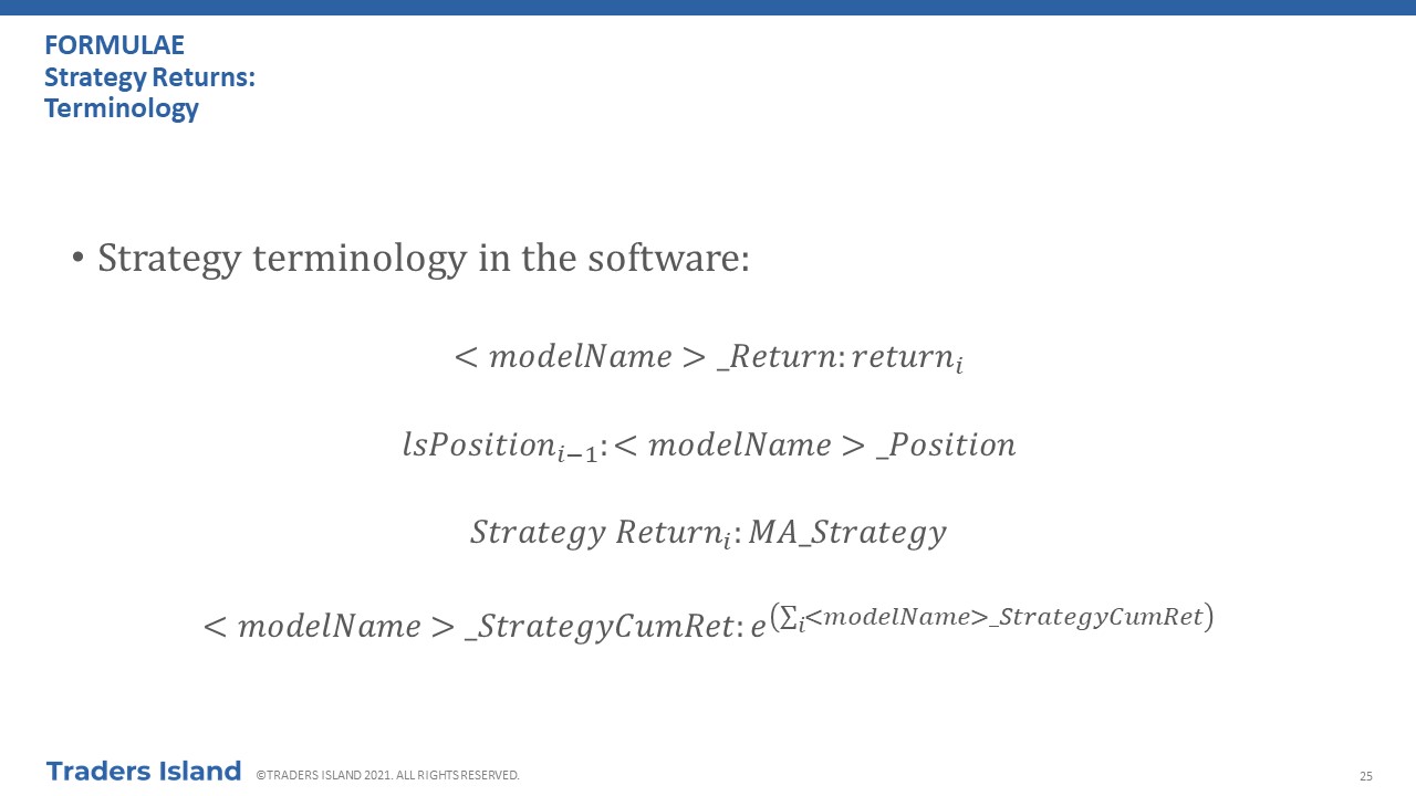
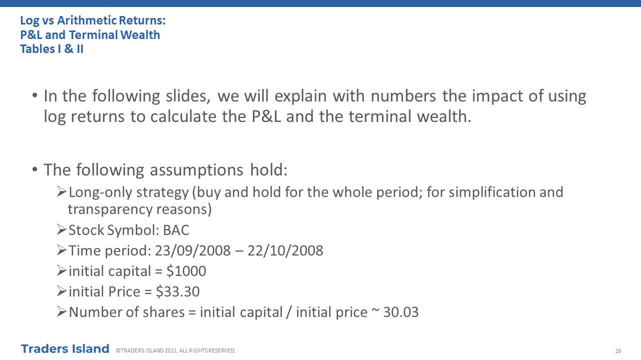
III.4 - Strategy Back-testing
Before you start trading, you need to ensure that you have a system that works. If you do not have a trading strategy that works most of the time, you will not be able to make money. The bottom line is that you need to ensure that your strategy has a positive expectancy. To do so, you have to back-test your strategy before implementing it in real time. We have dedicated one whole tutorial on the subject, which you can study should you wish to delve deeper into the topic. Alternatively, you may prefer to scroll through the below presentation for a quick exploration.


FAQs
Have a question on Technical Analysis? Check out answers to some popular questions below. Alternatively, write to us!
What is the difference between Fundamental Analysis and Technical Analysis?
Fundamental analysis aims to find the stock's "fair value" based on the company's underlying financial statements, industry characteristics and trends, as well as internal and external factors. Technical Analysis does not care about "fair value" or underlying factors. Instead, it tries to establish patterns based on historical data.
How does Technical Analysis fit with the Efficient Market Hypothesis?
It does not fit! The Efficient Market Hypothesis stipulates that prices follow a random walk so it is impossible to be able to predict where the price will be going based on historical values.
Before You Go...

Moving Averages
We have dedicated a full page to explaining the concept of Moving Averages and to applying it using our free web-based platform or fee-based spreadsheet.

Fundamental Analysis
So now that you have an idea of how Technical Analysis works, why not take a look at the pages we have dedicated to explaining Fundamental Analysis?

Stock Selection
OK! So now you understand Technical Analysis and Fundamental Analysis. You may have even explored offered tools. How would you go about selecting stocks?!